We rebuilt our address book widget from the ground up and we know you’re going to love it.
6 years ago we launched our first address book widget to let our customers quickly embed their users’ contacts into their websites. Since then, it has been used on over 150,000 websites and it has processed over 17 million address books for our customers. Here are some of the other interesting (vanity) metrics that might surprise you:
- We’ve added dozens of new features since launching it
- We’ve found and fixed hundreds of bugs
- More than 6 billion individual contact records have passed through it
- It has been skinned with custom CSS hundreds of times
- It has been translated into 33 languages
This year we made an overdue investment in a complete rebuild that leverages the technology changes that have happened since 2010 and everything we’ve learned along the way.
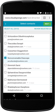
A New Design Optimized For Mobile

It’s clear to anyone who has looked at their web analytics for the last few years that their websites are being accessed by a steadily increasing number of mobile browsers.
Our customers’ websites are no different so we’re committed to making sure that our new address book widget works beautifully on all screen sizes.
We’ve included a tappable alphabet in the right margin for portrait orientation mobile screens and native UI elements (e.g. roulette wheel) for selecting which email address to use when a contact has more than one.
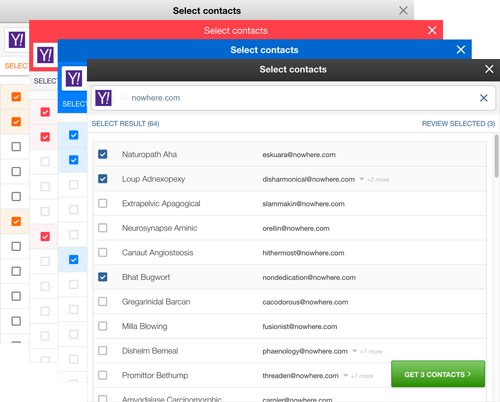
A Completely Refactored Skinning Engine

Over the years our customers have spoken loud and clear. They want to be able to customize our widget to look exactly like their website so that their users don’t have a disjointed user experience.
That’s why we made sure that our new widget is more than just “skinnable”. Of course it still does the easy stuff like changing colors and fonts, but it’s also built in a way that allows our customers to completely refactor the HTML by moving elements, replacing glyphs and images and skipping steps in the flow.
Modern Search Controls

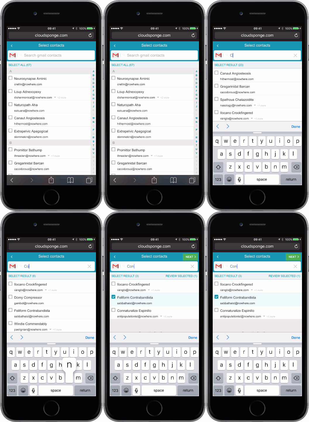
Popular websites like Google, Facebook, Twitter, LinkedIn have set everyone’s expectations for how search interfaces should behave, so we’ve followed their lead with ours.
The search results reload on every keystroke for instant feedback and efficient searching. We’ve also included inertial scrolling and a tappable alphabet on mobile screens for a familiar and native feel.
It’s intuitive, fast and powerful and your users will be able to easily find people in their contacts regardless of the size of their address books.
An Optional Selection Review Step

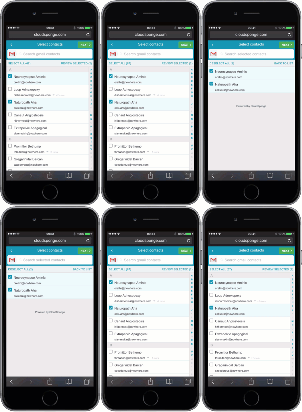
Address books are huge. On average they have about 350 records (we’ve seen thousands of them with over 10,000 records). Once a user goes through the process of selecting a couple people, it can be tedious and annoying to change their minds without a fast way to reviewing their selections.
As soon as a user selects at least one contact in our address book widget, a new “Review Selections” link appears that behaves sort of like a shopping cart. It shows the user who they’ve selected and gives them a simple way to deselect someone or change the email address that they chose for contacts that have more than one email address.
Try It
We’re very excited to have you try it out with your own address book on all of your devices. You can provide feedback here (in the Disqus widget below), by emailing us at support@cloudsponge.com or by joining us in the CloudSponge Slack community.
Get It
Starting on July 1, 2016 all accounts on current pricing plans will be given access to the new address book widget by default. If you’re on an old pricing plan please reach out to us at support@cloudsponge.com to ask for an upgrade and we’ll personally help you choose a new plan that fits your usage.
* Editor’s Note: Since publishing this news article, we’ve renamed our Address Book Widget to “Contact Picker.”
