With the rise of the Internet came an interest in raising money through it. Enter crowdfunding: the ability to raise a large amount of money online by combining smaller donations. Crowdfunding comes in many flavors:
- to raise money for artistic endeavors
- to fund a new product
- to donate to a cause and
- to help a friend in need, to name a few.
GoFundMe has emerged as the leader in the personal fundraising space. Unexpected medical bills? Want to buy your daughter’s class a new set of books? Want to support a veteran’s return home? GoFundMe may be the right platform for you.
While it’s easy to focus on the user experience of giving money to a campaign, it’s also important to streamline the experience of the person creating a campaign, aka the fundraiser. GoFundMe is a fundraiser-first platform. Let’s take a deeper look here and in the video below.
Want to replicate GoFundMe's success?
Start with our Better Sharing Workbook today!
What does a great campaign creation process look like? There are several UX goals that need to be prioritized at different times in the user flow. Think of it as a funnel. The ideal fundraiser moves from one stage to the next to ultimately be successful:
- First, at the very beginning of this process, GoFundMe makes it easy to create a campaign.
- Next, they make it easy to share the campaign with potential donors.
- Finally, GoFundMe provides effortless tools to keep donors engaged as the campaign continues.
Let’s take a deeper look at each of these.
1. Easy to Create a Campaign
First things first: basic usability. It needs to be simple and straightforward to create a crowdfunding campaign. GoFundMe nails it here! First, there are very few steps to create a campaign. Each one is absolutely vital, with any “nice-to-have” steps removed. Making this process manageable means that more fundraisers will begin and complete the campaign creation process.
Next, GoFundMe does an excellent job at providing prompts to guide the fundraiser through the process.
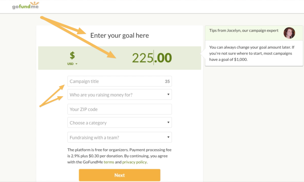
I don’t have to guess what goes in each spot. What’s more, they go on to motivate why I should complete each step. Add a Photo or Video might be met with a range of reactions from, “Ugh, that sounds hard,” to, “You can’t tell me what to do!” But GoFundMe sidesteps both of those by providing a brief explanation: A high-quality photo or video will help tell your story. Phew, that’s a relief. I want to tell my story well, so I’ll happily upload a photo.
(Want more examples of how GoFundMe motivates user behavior? View the video featured at the beginning of this page.)
On top of the short campaign creation process and excellent prompts, GoFundMe also autosaves as you go. No need to worry that your (not-so-hard) work will be lost to a poor Internet connection. Hooray! And with that, I just created my first fundraising campaign. Now what?
2. Easy to Share a Campaign
(Spoiler: email matters most.)
Can you guess one of the most common mistakes first-time fundraisers make? They incorrectly believe, “I just need to launch my campaign and then poof! Money will appear.” Unfortunately, that’s not the case.
Fundraising campaigns need lots of promotion to garner attention. Post it, share it, email it. Get it on the local news. Your campaign will need lots of eyeballs to be a success.
GoFundMe does a stellar job at guiding their fundraisers through this process. Immediately after the campaign is created, fundraisers see the triumphant Your Campaign is Ready! and are invited to share it.
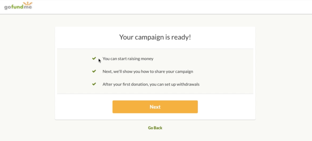
Compared with other crowdfunding platforms, GoFundMe includes highly personal campaigns, such as “Help pay my dog’s vet bill” and “Fund the elementary school’s playground.” These aren’t (usually) international campaigns, which means that your most likely donors are those who are close to you or the cause, i.e., your friends and family.
Enter email: personal recommendations are the most likely to generate donations, and email is a great avenue for them. GoFundMe helps fundraisers easily share via email. They are able to import their Gmail, Outlook, and Yahoo! contacts via the CloudSponge widget.
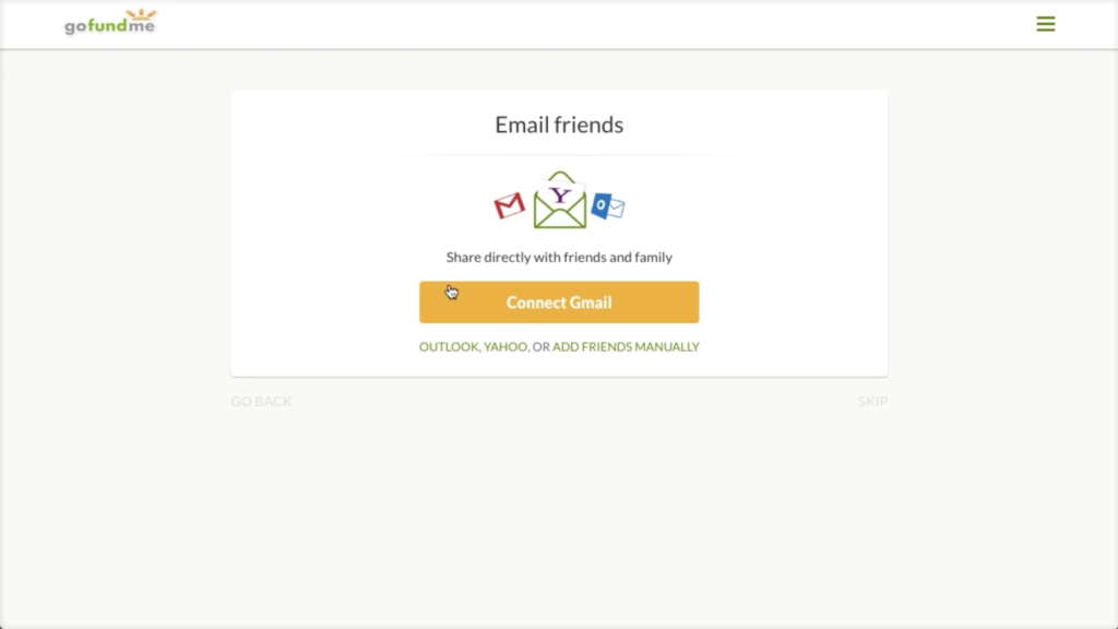
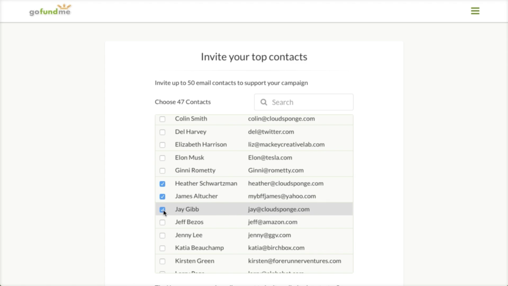
This makes it simple for fundraisers to share the campaign with lots of relevant people. The click-to-choose interface also reduces the risk of mistyping someone’s email, ultimately increasing deliverability.
GoFundMe goes one step further. Not only do they provide easy access to your contacts; they even highlight which of your friends have donated via GoFundMe in the past!
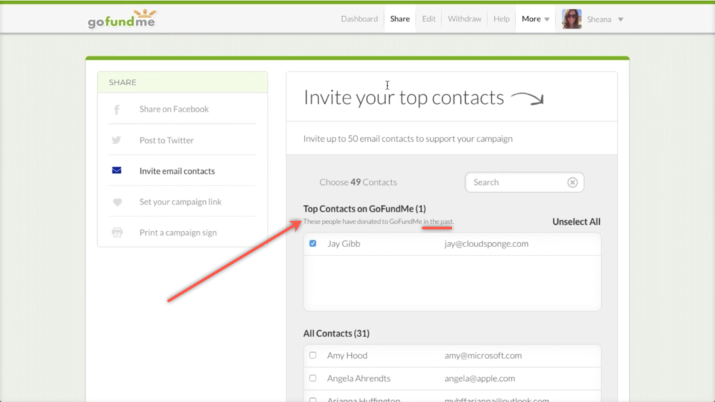
Past behavior is a great predictor of future behavior. Effectively, they’re giving you a cheat sheet of who will be more likely to donate to your campaign. That was easy!
Facebook Best Practices
After sharing via email, GoFundMe guides fundraisers through numerous other ways to share. They do a few things especially well for their Facebook sharing. As we mentioned before, a great user experience helps motivate user action whenever possible. GoFundMe doesn’t just say “now share on Facebook.” They say Sharing on Facebook can increase donations by 3x. Whoa. Three times the donations? I’m convinced! Sharing sounds kind of hard, but I’d love three times as many donations.
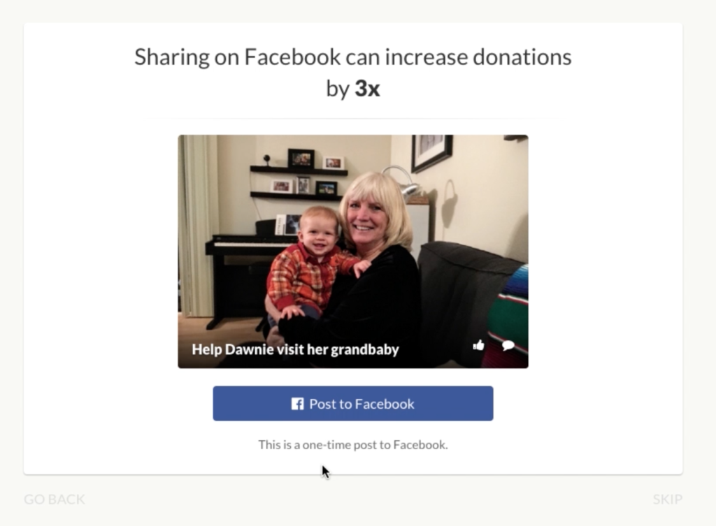
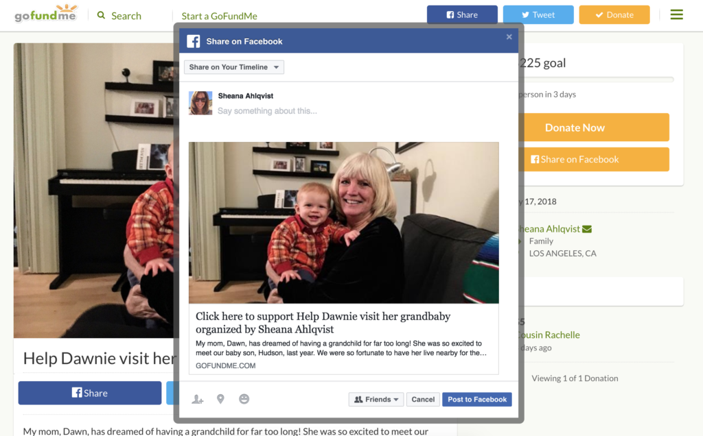
What’s more, the Facebook post that they provide for me is well-executed: it automatically pulls in the title of my campaign, its description and, most importantly, the photo from my campaign.
GoFundMe campaigns tend to be highly personal, and the best way to get donations here is to show a familiar face that my friends may recognize.
(For more on the importance of faces in website UX, see my teardown of Hired’s referral program.)
The GoFundMe campaign I created for my mom features a photo of her smiling face. While it might not mean much to just anyone, you can bet that it will catch the attention of her close friends and family. Altogether, the Facebook post that GoFundMe provides is a highly effective one.
3. Easy to Keep People Engaged
I’ve already created my GoFundMe campaign in a few easy-to-follow steps and shared it with my friends and family. I’m done, right? Not so much. The most successful fundraisers continue to engage their donors even after they have made a donation. To understand why this is important, it may be helpful to back up.
At the core of all of this is a key question: why would someone donate to a campaign? Researchers have found that a primary reason we give is to feel good. Humans are social creatures, and helping others is intrinsically rewarding; it makes us feel great! We also love to talk about how great we are. An “I just donated to this great campaign” post on social media is the ultimate humble brag.
Ongoing engagement leverages all of this. First, updating people on your campaign’s progress reminds them that they donated in the first place. Cue the tiny hit of dopamine! This reminder makes them feel good and creates an opportunity for them to share your campaign again. Cue another humble brag and some more dopamine!
GoFundMe makes it easy to keep donors and potential donors engaged. During the campaign creation process, the fundraiser can give permission to post daily updates to Facebook automatically. Talk about easy! One click and my campaign will be automatically promoted every day.
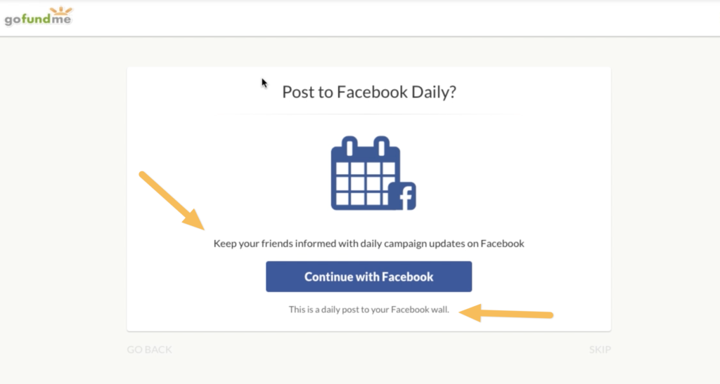
A few minor tweaks would make this functionality even stronger.
First, I’m not sure what exactly an automated post would look like. GoFundMe could add an example post to set my expectations.
Second, I would argue that it’s almost too easy to update people on the status of my campaign. One single button click to share something every day? It feels like an awfully easy action for something that will have an ongoing impact on what I’m sharing with my friends. And what if I change my mind? They should include brief instructions on how to turn it off. A quick “You can turn this off anytime in the X menu” would go a long way for users who are on the fence.
GoFundMe also encourages donor engagement directly on the campaign page. After the campaign creation is complete, the fundraiser is hit with a huge call to action: Post an Update. They even provide a brief explanation (Update your supporters and attract new donors) to motivate me to do so.
They could make this even stronger by saying a bit more about who will see the update and where. Will this be posted to my Facebook feed? Will it be emailed to anyone? This simple change would make it even more appealing to share.
Altogether, GoFundMe does an excellent job at encouraging fundraisers to engage their audience and makes it easy to do so.
Fundraisers Are Users Too
As online fundraising has grown over the last decade, it has become clear that the donor’s user experience matters when trying to raise money. It’s easy to overlook that the individual fundraiser creating the campaign is also a key user, but GoFundMe nails their user experience.
As discussed above, they make it easy to create a campaign through a super pared-down process. They motivate the user through each step and provide autosave functionality to make sure their work never gets lost.
Next, GoFundMe makes it easy to share the newly created campaign. They are smart to start off with sharing via email. Many fundraisers won’t complete the entire sharing process, so putting email (the most successful referral channel) first ensures that their efforts will be fruitful. They even provide contact-importing functionality thanks to the CloudSponge widget, ensuring that typos won’t slow down the invitation process.
Last of all, they clearly guide the fundraiser to engage their audience. Upon creation of the campaign, fundraisers are immediately brought to a huge call to action inviting them to update their supporters. GoFundMe also makes it easy to post daily updates with automatic Facebook posts.
Fundraising is more complicated than it looks, but GoFundMe makes it as easy as possible to start raising money.
Be sure to view the video at the top of this page to see how this all comes together. Was this teardown helpful? Share it with the rest of your team.
Improve your sharing features and get more sales today!
Download the Better Sharing Workbook Now
(it's quick, easy and absolutely free!)

