There was once a time when designers sat side by side, looking at their work together and making changes in person. Those days are gone. With the rise of the Internet, workforces are increasingly becoming remote and distributed. A company’s project manager might be in Los Angeles, while their design team’s in Barcelona and their developers in Argentina.
InVision is a popular web-based prototyping tool for apps that makes virtual collaboration possible. Users can upload simple prototype screens and add “hotspots” to allow for interactions between the screens. It’s great for showcasing a product while it’s still half-baked, especially for early user testing and client feedback or approval. Core to InVision’s success is its value as a collaboration tool. And collaborations can’t happen until one user has invited others. InVision has one of the strongest invitation flows I’ve seen.
Want to replicate InVision's success?
Start with our Better Sharing Workbook today!
Invitations Designed with Designers and Teams in Mind
Project collaboration is a core benefit of InVision, and they clearly leverage this focus throughout their invitation process. Their calls to action are strong: “Invite People to Project” and “Share Prototype.” Both of these emphasize the actual project or prototype, not just a generic “Invite others to InVision.”
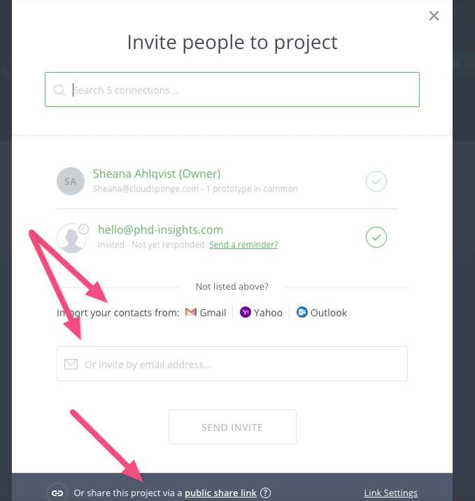
As with most successful invitation experiences, InVision leads with email. Users can either type email addresses directly into a visible text box or import their contacts from Gmail, Yahoo, or Outlook using the CloudSponge Contact Picker. The contact import option likely increases the number of invitations that get successfully sent. This is because choosing individuals from one’s contact book makes it easier to send multiple invitations at once. At the same time, it also reduces the risk of typos. Smart choice, InVision.
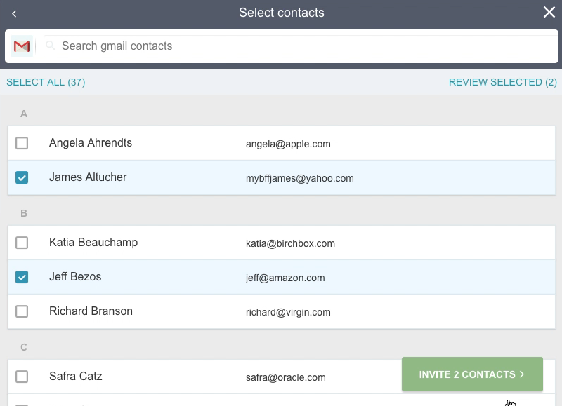
Want to see our Contact Picker for yourself? Try our live demo. (No CloudSponge account required.)
InVision also offers URL sharing (more on this later) and a Slack integration that allows users to invite team members directly on the channel where they may communicate most often. This integration makes sense, given the nature of their users.
Internal and External
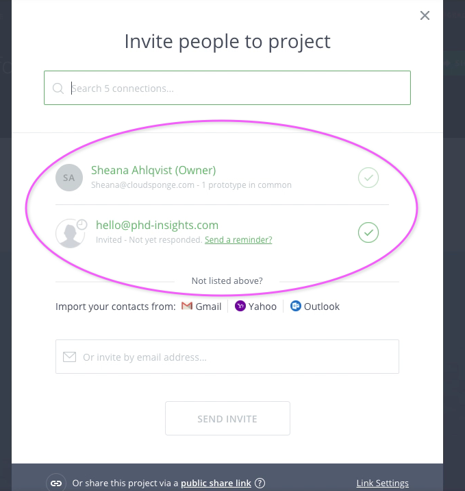
Many invitation programs assume that users are sending invitations to non-users who would be joining the platform for the first time. InVision is a little different. If they provide value (and they do), they should expect teams to use InVision on several projects over time. As such, they put heavy emphasis on inviting users to specific projects within the larger platform. They do this by maintaining an internal “address book” – those who have been sent invitations in the past are visible to be invited to additional projects in the future.
If I hired a great designer last year, maybe I want to invite her to a new project. InVision makes this easy. For many platforms, this emphasis wouldn’t make sense. After all, how many times can I reinvite someone to join Facebook once they’ve already joined? But for InVision and other software tools that emphasize ongoing, collaborative use, this is a great UX decision.
Beyond the Basics of URL Sharing
Not all collaborations are created equal. Sometimes, designers want to show just part of a prototype. Sometimes hotspots, making certain parts of each screen clickable, are distracting or unnecessary. For all these reasons, link settings are available to control the information being shared.
Some of the options specifically protect privacy, including password protection or requiring user identification. Others focus on the kind and amount of information being shared, including disabling or hinting at hotspots. Similarly, users can choose from which screen the prototype should begin (for instance, on the onboarding screen or at a key screen after onboarding). They also allow the user to disable commenting.
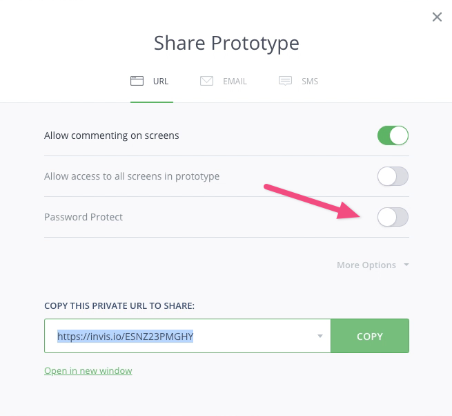
Something InVision does especially well is keeping this invitation process simple despite offering this complexity to those who want it. The invitation screen emphasizes two main invitation channels, email and URL sharing, with a clear call to action. But they cleverly tucked the aforementioned sharing options in the “Link Settings” area. This strikes a wonderful balance between minimizing the elements on the main invitation screen for simplicity while also providing additional complexity for those who want it. Remember, adding complexity may distract users from completing the desired action. This is one way around that.
Great Invitation Onboarding
Last of all, InVision takes steps to ensure that the invitation is accepted. The invitation email highlights who sent it in several key ways. First, the sender’s name is listed in the from field, in the subject line, and at the very top of the email. The email itself includes strong, specific language from the very beginning: “Sheana Ahlqvist wants to collaborate on a prototype.” Again, they do not use a generic “Sheana wants you to join InVision.” They say why: to collaborate on a project.
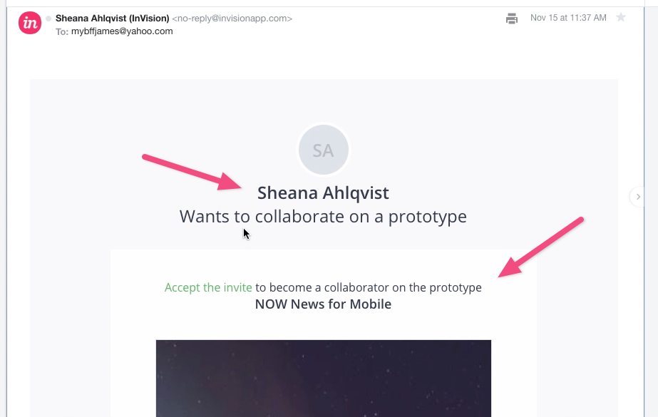
They go further with a clear call to action (“Accept the Invite”) and naming the specific project. Seeing the name of one’s project makes this as relevant as possible. I can’t emphasize enough how good a job they do here. This is miles and miles better than “Someone you know invited you to try InVision.” It’s personal, specific, and actionable.
Finally, the last piece of the invitation onboarding is key. When the recipient does accept the invitation, they are not brought to a generic InVision landing page; they are instead brought to a customized landing page that reiterates: “Sheana Ahlqvist invited you to collaborate…” Note: View the video at the top of this page to see this user flow in action.
Once the recipient completes the sign-in process, they are taken directly to the specific project to which they were invited rather than being dropped onto a generic page.
A Solid Invitation Program Understands Its Users’ Goals
Taken together, InVision’s invitation process is especially well executed. To recap:
- They offer complex functionalities, but never at the expense of ease and simplicity.
- They understand that they are a collaboration tool, and they include Slack integration and an internal address book to support this use case.
- Their copy is concise and specific.
- They include personalization in the invitation email and onboarding
Although each company’s goals may differ, InVision shows how understanding those goals can impact a product at every turn. While they focus on collaboration, product managers at other companies should be thoughtful about their core users’ goals and use them to determine which of the above characteristics may be important for them.
Want to learn more about other great invitation programs? See how Nextdoor handled insane growth challenges.
Improve your sharing features and get more sales today!
Download the Better Sharing Workbook Now
(it's quick, easy and absolutely free!)

