In a world where 30% of people can’t list a single neighbor by name, the goal for Nextdoor became clear: create a private social network connecting neighbor to neighbor. But the need — We’re not connected — comes with an intrinsic challenge: how does a technology solution facilitate inviting people who don’t know each other? In this teardown, I take a look at the user experience Nextdoor implements to support their viral growth, including some super cool offline components.
Nextdoor connects neighbors
Nextdoor is a private social network for individual neighborhoods. Their goal is to be the go-to digital space for people who want to link the people within their community. And they’re good at it! As of 2017, Nextdoor was in over 160,000 neighborhoods across the United States and parts of Europe. Think of it as Craigslist meets Facebook.
Are you in charge of product design or user experience at a social networking company? We can help you optimize your find-a-friend interface.
Nextdoor needed a strong invitation strategy to get to where they are today, burdened by some unique challenges. First, as mentioned above, they needed to provide a solution to connect people who literally don’t know one another, no simple task. A second, bigger challenge is they don’t have to create just one social network (which, by the way, is super hard). But because every neighborhood is its own private network, they essential have to do this A HUNDRED AND SIXTY THOUSAND TIMES. Ouch. It’s like every neighborhood is its own tiny startup; saturation in one neighborhood is irrelevant to any other. Let’s take a look at how they do it in the video and write-up below.
Want to replicate Nextdoor's success?
Start with our Better Sharing Workbook today!
Two Types of Invitations
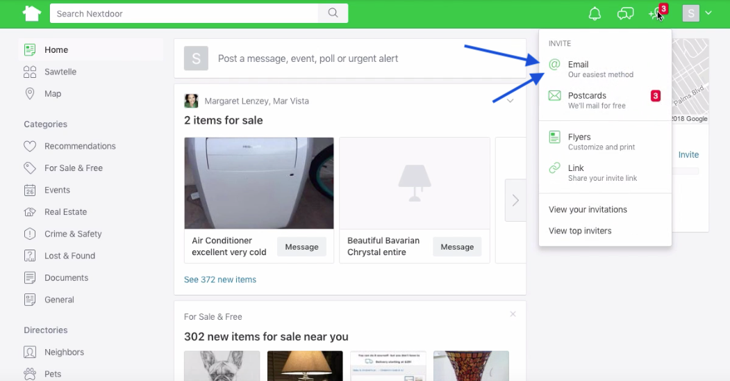
Upon arriving to the Nextdoor’s web-based feed, there is a red, eye-catching notification badge over the navigation menu on the upper right.
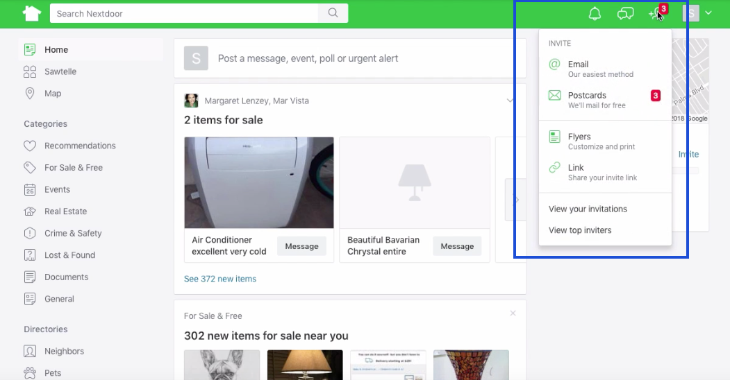
I felt compelled to click it, just as Nextdoor wants me to. It brings me to their main invitation options:
- Postcards
- Flyers
- Link
Nextdoor takes a many-pronged approach to let users invite two distinct groups: 1) neighbors, who the user may not know and 2) the user’s run-of-the-mill friends and family. For their neighbors (who they may not know) postcards and flyers will do the trick. For run-of-the-mill friends and family, email and link sharing make the magic happen.
Inviting Total Strangers
So, you’ve got a bunch of people who don’t know one another beyond “tall smoker guy” and “you know, the CPR-lady downstairs.” What Nextdoor understands is the one thing they all have in common: location. Unlike many cyberspace-only technologies, Nextdoor is built upon social groupings created by physical space.
Postcards
Enter an unlikely solution: snail mail. During onboarding, the user must enter (and verify) their own address. Nextdoor capitalizes on this by identifying USPS-verified addresses nearby and allowing its users to invite neighbors via postcard. The user can manually choose which homes to invite or click the Select Nearest option to automatically select the nearest neighbors.
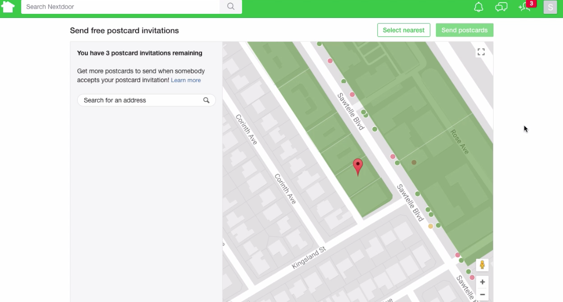
They even indicate which neighbors are already on Nextdoor, who was recently invited, and who hasn’t been invited yet. Once a network has taken off, as in the case of Nextdoor, this is an intuitive form of social proof: “Many of my neighbors are using Nextdoor, so I should too!” It also ensures that Nextdoor isn’t wasting postcards on neighbors who are already in the network.
Nextdoor is likely using a mailer API to handle this at scale. For instance, Lob is a cool cyberspace-to-IRL API that lets online actions trigger the mailing of postcards. They have features for A/B testing and template design, and they even integrate with Zapier to do all the things.
After clicking on “Send Postcards” Nextdoor has the user confirm that they are ready to send the physical invitation. They also clarify that the invitation will contain some personal information, namely the user’s name and their street name. The user confirms, and the postcards are in the mail! But the IRL-invitation options don’t end there…
Flyers
Nextdoor provides another set of options for inviting locals in the form of the classic neighborhood flyer. Moreover, they do a stellar job at making it somewhat customized while still easy for their user. They provide a series of templated invitations that automatically pull in the name of the neighborhood and the first name of the user. They also include custom invite codes to enable conversion tracking.
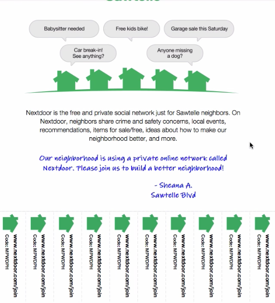
With the custom flyer in hand, Nextdoor users can easily post them on telephone poles and pin them to their coffee shop’s community board. They also provide options for printable postcards, window signs, and door hangers. If you don’t know any of your neighbors, that won’t stop you from inviting them to Nextdoor.
Inviting Friends and Family
Email is the easiest (and best).
But what about the people their users do know? Word of mouth recommendations are the be-all and-end-all of marketing and email is a great avenue for them. Nextdoor is smart to prominently feature email as an invitation channel. It appears at the top of the Invite menu with the appealing caption the easiest method [for sending invitations]. After a user finishes sending their postcard invitations, Nextdoor shuttles them to the email invitation page and poses the motivating question “Who else needs an invitation?”. They do an excellent job at prompting users to invite others here, featured in the video teardown at the beginning of this article.
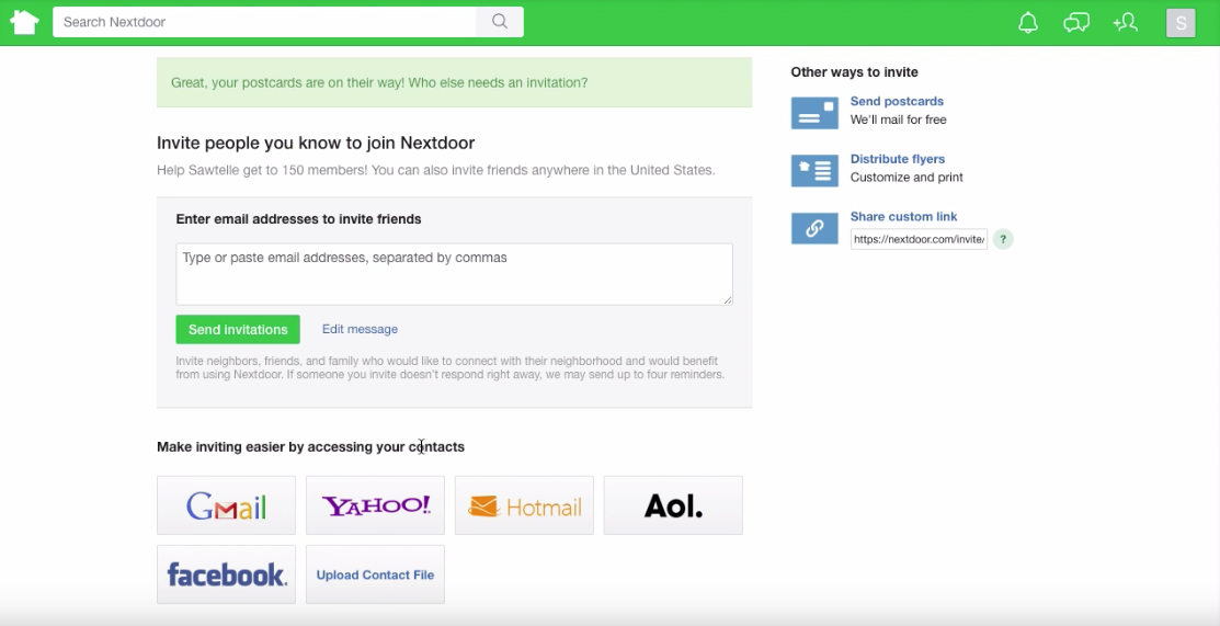
Nextdoor employs a couple of great UX practices to make the email invitation process smooth and painless. First, they let users easily import their contacts courtesy of the CloudSponge Contact Picker. This reduces the friction of having to remember email addresses and ensures that all email addresses are accurate (and, in effect, deliverable). Moreover, it lets users pull in their contacts whether they use Gmail, Yahoo!, Hotmail, or AOL.
Want to see our Contact Picker for yourself? Try our live demo.
(No CloudSponge account required.)
Nextdoor also provides suggested invitation copy. First and foremost, this reduces the friction for the user. But it also increases the likelihood that the message being shared is one of which Nextdoor would approve. After all, they wrote the copy. Last but not least, the user can both view and edit the text before sending, important components of a stellar invitation process.
Link Sharing + Giving your users what they need to succeed
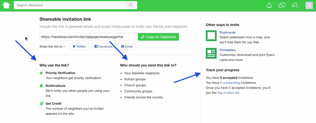
As with any good invitation program, they also provide a custom invitation link that can be shared just about anywhere. This is also where they encourage inviting friends via Twitter and Facebook. In fact, they include a few other pieces of information here that could be incorporated into other parts of their invitation process.
“Who should you send this link to?” is one of those. Here, they list specific kinds of people a user might invite beyond their neighbors, including school groups and community groups. By including these examples here, they are making it easy to think of additional invitation opportunities. They should include this info earlier in the invitation process, when it would be more helpful.
In the “Why use this link” section, they also state some of the benefits of using the invitation link. “Don’t just recommend Nextdoor willy nilly. Use your link, please!” Here, they help motivate that behavior. First, they mention that neighbors will get “priority verification.” There aren’t many details here on what this means, but it seems like someone who joins with an invitation link or code is able to register without having to go through Nextdoor’s address verification process. That is actually a substantial time-saver, and quite a nice perk. I would love to see them clarify this a bit more here, to ensure that users understand it.
They also leverage a gamification feature to encourage sharing. Here, they mention successful sharers will “get credit” for bringing neighbors into the network. Their success is then displayed on the Top Inviters List, along with their name and photo. This instills a spirit of achievement and public recognition in the community. Hooray!
Nextdoor also sets an attainable goal for those of us who won’t be topping the leaderboard: Once you have three accepted invitations, you’ll join the Top Inviters list. “Three invitations? I can do that!” This tempered goal ensures that invitations won’t just be limited to the power-users among us; the bottom should get lifted too.
Nextdoor: The best of online and offline invitations
As with all social networks, the value of one’s Nextdoor network increases in proportion to its size: the more people in the network, the more people available for interactions. Inviting one’s “total stranger”-neighbors actually makes Nextdoor more valuable to the original user and provides value to those new users as well. That being said, Nextdoor has unique invitation challenges and created a strong solution to grow their platform in spite of these.
They make use of some of the best practices for online referrals, including using the CloudSponge widget for easy email invitations. They also guide the user to make successful invitations by providing editable invitation copy suggesting kinds of people to refer (i.e., schoolmates) and motivating the use of their referral code.
But what really makes them stand out is how they handle the “let’s invite people I don’t know” problem. They utilize traditional mailers by pairing it with modern technology, letting their users choose nearby addresses to which they can send postcard-invitations. All together, Nextdoor does a top notch job of combining novel invitation strategies with well-implemented classics.
Be sure to view the video above for additional details on Nextdoor’s invitation experience. Was this teardown helpful? Share it with the rest of your team.
Improve your sharing features and get more sales today!
Download the Better Sharing Workbook Now
(it's quick, easy and absolutely free!)

