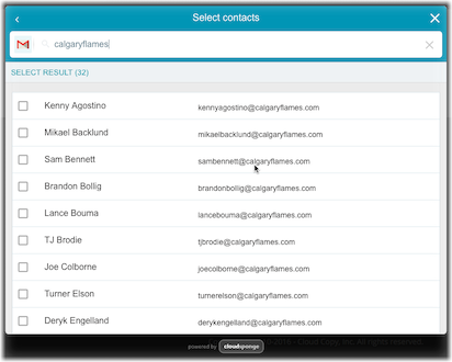
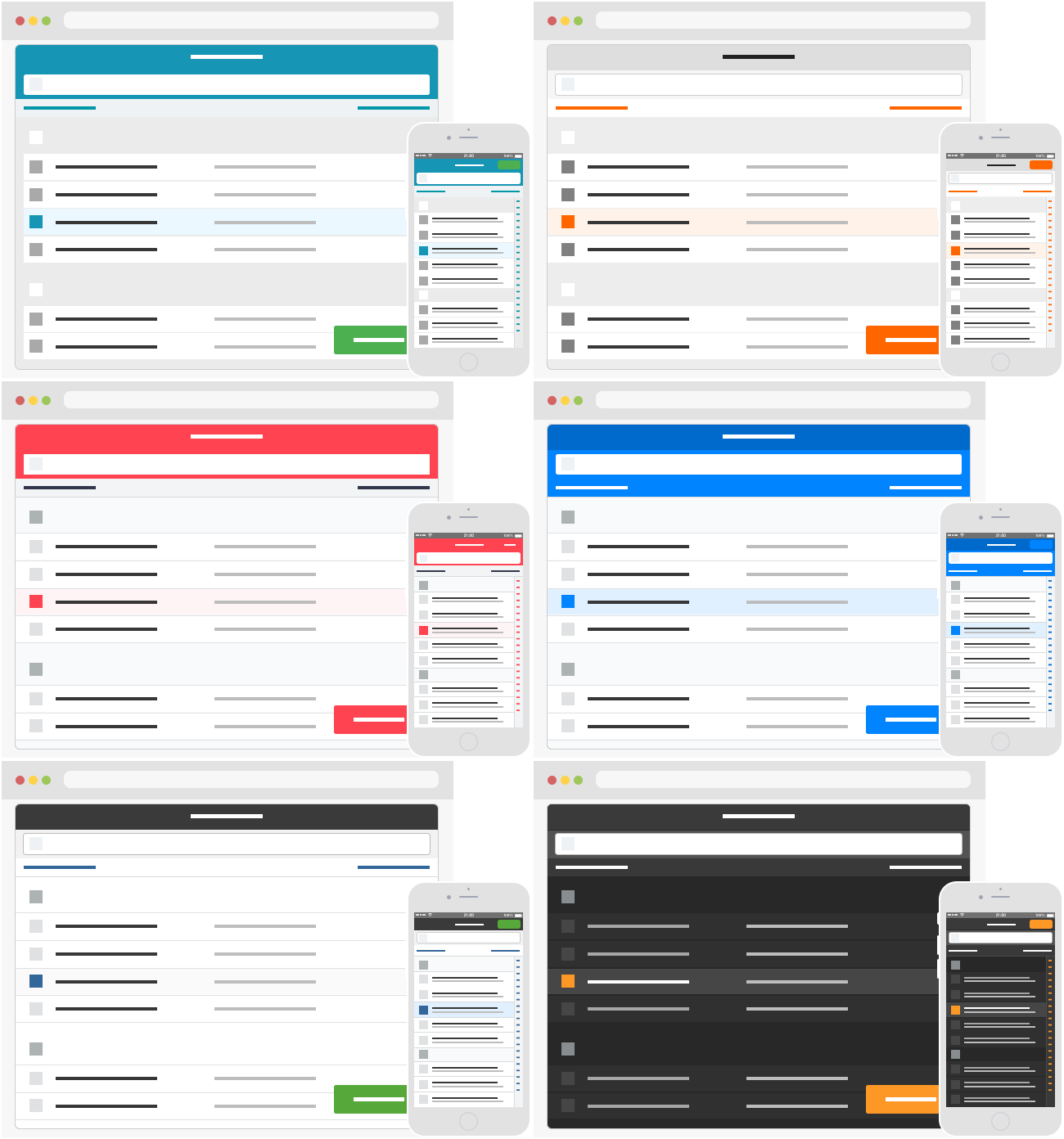
Yes, our new widget is beautiful, but it’s about much more than just aesthetics.
The new widget has been completely redesigned with a guiding focus: maximize the address books that are shared with your site.. We think the best way to do that is to look at how people interact with our widget and remove every possible obstacle. We’ve taken the experience and feedback from 7 years of running a widget and rebuilt it to optimize the user experience.

Ease of Use
We put a lot of effort into ensuring that the list of contacts is as easy as possible to use.
- The new layout increases size and spacing to make it easier to read.
- Searching is faster and the search bar gets out of the way when it’s not needed.
- We added an optional review step so that users don’t second guess if they are sharing their desired contacts with your site.
These changes encourage people to complete the connection process by helping to build trust and align their expectations.
Mobile is a significant source of traffic on our widget and we anticipate this to increase. So we took special care to optimize for smaller screens and use native behavior whenever possible. For example, when selecting from multiple email addresses for a single contact, we use the native select behaviour on mobile devices (on desktop, it’s preferable to style the select element so we’ve made it look beautiful there too).
Scrolling on a mobile device feels natural with the support of inertial scroll. We added alphabet links down the side to help find your contacts quickly. And the display is truly responsive, adjusting spacing and sizing to accommodate traditional and touch devices. The result is an integrated mobile browser experince that feels like a native app.
To properly support these features, we rearchitected the widget so that it renders as part of your site. This has resulted in a faster, smoother and more polished user experience.
Beyond Customizable
The redesign has also helped make the widget even more customizable. It still supports overriding the stylesheet and customizing the language. But beyond colours, fonts and borders, you can now actually change the HTML in the widget to add your own special features. One customer now displays the phone numbers in the list in place of emails. Another has added company name to each contact row. And these are just the beginning to what can be done.
Data-centric
Finally, we’ve taken a new approach to collecting data about how users interact with the widget. We’re collecting metrics on all the things people do as they connect their address book to your site. Most notably, we are measuing the number of contacts that they submit. We want to be held accountable to not just the number of address books that we help share but also to the number of individual contact records. As we collect these data, we’ll be able to continue to improve the user experience to maximize the number of address book connections your site sees.
The result of these incremental improvments is an likeable, easy-to-use widget with better support across all platforms. So far, customers using the new widget have seen a dramatic increase in completions, meaning more users are sharing their contacts.
The Nitty Gritty
Let’s dive into some of the new features.
Optimized for Completion
There are a bunch of design decisions that we evaluated for the new widget. We looked at all of them through the lens of whether they would help users reach the goal of sharing their contacts with your site. That’s why we included:
- The new optional review step helps to clearly set the user’s expectations about which contacts they have picked. This builds confidence in completing the final step and sharing them with your site.
- We debated decisions that have led to a simple UI, reducing decisions that a user needs to make to connect their address book.
- We decided to display a single email address on a line and let the user pick the one that is most interesting.
- We’ve sweated details like ensuring that the widget displays in a modal context, preventing the tab key from shifting focus to the inaccessible background.
True Mobile Support
Mobile support has been a big motivator for the new widget so we wanted to do it right so we made sure that the new widget is responsive and mobile first:
- We optimized tap target sizes for mobile devices.
- We’ve made sure that the OAuth flow is supported seamlessly by redirecting the mobile browser instead of trying to manage a separate window. Switching browser windows is clunky at best on a mobile device. The small screen size is well suited to this using a redirect so that the user’s attention is focussed on one step at a time while they connect their address book.
- The UI is seamlessly integrated with your site, literally. We rearchitected the UI so that it renders HTML directly on your page. Mobile devices benefit from natural sizing and scrolling experience which is especially noticable on mobile devices.
Address Book Caching

I’m really excited about this feature.
Our data shows that sometimes people will connect their address book more than once. They may have realized that they forgot to add someone the first time through. Or initially they may not have been comfortable connecting their address book with your site.
We believe that these people deserve a second chance without having to connect their address book to your site again. This is why we’ve made it possible to cache the address book right in the browser. The next time a user connects their address book is instantly ready for them. Additionally, because these interactions don’t hit our API, they don’t count against your monthly usage, so you optimze your usage of our service!
It’s an edge case that we’ve covered to ensure that you and your users get the most value out of our product.
Built-in Translations
Instead of making you translate every string in the widget yourself, we not offer pre-built translations of our widget into several languages. You can switch between them by changing a simple option so that customers all over the world will feel at home with our widget.

We currently support a small set of translations so that localizing the widget is a breeze. More translations are yet to come. If there are any you are interested in, tell us about them and we’ll prioritize them.
The new translations engine also makes it easy to affect minor changes. Want to make the button say Invite 5 Friends? Done!
CSS Styling to fit your site

We’ve taken care to properly isolate class names and styles between your site and our widget and we think the default style looks damn fine.
But you might want to tweak our styles, or give them a complete overhaul. The choice is yours and it’s straightforward.
Filtering Contacts
Focus users on a smaller list of contacts by filtering on any criteria you like. You can define your own Javascript code to display only the contacts you choose.
3rd Pary Integrations
YesGraph is a product that will help you rank contacts in an address book by their potential value to your business. You can configure the new widget with your YesGraph key and we’ll display the suggested contacts at the top of the list, making it more likely that users will choose them.
We’ve also added an integration with Google Analytics so that you can visualize your funnel in your own GA account. Since the widget UI displays on your site, you can configure the widget to send events using your own tracking id.
Beyond Styles: Custom HTML
If you ever run up against a customization that we don’t already support in the widget, it can probably be implemented by overriding our HTML templates. We have customers who display telephone numbers in the widget, instead of email addresses. Others have added tooltips to our pages. It’s all possible and I can’t wait to see the other ways that customers want to tweak our widget. Reach out if the widget doesn’t look like how you want it to and we’ll figure it out!
New Metric: Number of Contacts Shared
This much-requested feature has been properly implemented in the new widget so that we can track and share the real benefit to your business. We’ll be making this data available in your account this fall.
Custom Analytics
You can now set your Google Analytices ID and we’ll send widget events to your GA account. You can use this data to visualize the conversion funnel and evaluate the performance of our widget.
If you need more flexibility to run A/B tests or sending events to a different analytics provider, you can implement a number of new callbacks to handle your own event tracking within the widget UX.
More than a Pretty Face
The new widget is about much more than just aesthetics. It is a byproduct of our dedication to maximizing the address book connections you will get from our service.

